Extensive Customized BigCommerce Migration
Team merchandise shop CampusColors.com relied on IntuitSolutions to perform their extensive migration project and integration with external resources. When they needed another feather in their proverbial cap, they of course reached back out to the same experienced team they knew would be capable of handling such a powerful idea.
Specifically, CampusColors.com wanted to expand their site usability, and IntuitSolutions drew up the game plan to get it done. By using a client-specific approach, we were able to split the uprights and give them exactly what they needed.
Individual Treatment for the Perfect Homepage
At IntuitSolutions, we treat each client as an individual, listening to your specific needs and making sure we understand your business and, most importantly, your audience. After all, if you can’t reach and convert your target demographic, what is the point of your site?
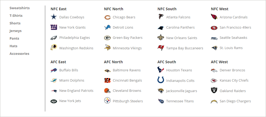
With such a strong sports culture, we wanted to take some design influence from major sports sites like ESPN.com. Since customers at Campus Colors are no doubt avid sports fans and familiar with a certain type of presentation, we wanted to make sure that our navigation structure emulated the ways that major sports sites lay out the leagues, divisions and teams in a way that felt natural.

For example, if you come to the site looking for a Baltimore Ravens hat, you should be able to find the item quickly no matter how you search. By hovering over “NFL”, the team dropdown menu layout is familiar for anyone who frequents ESPN.com or similar sports aggregate sites, and one can find “Baltimore Ravens” in the list. Someone less familiar with the NFL divisions may want to just look under “Hats,” available to the left of the team list. Finally, typing “Ravens Hat” into the search bar brings up the same destination. In this instance, since there’s only one Baltimore Ravens hat, you’re taken directly to the product page itself.
After speaking with Campus Colors about other usability tweaks, it was important to highlight brand recognition at the bottom of the home page. Sports culture lends itself to brand loyalty, and we wanted to use that in a way that made it easy for users to find their preferred brand’s products. They also found that much of their feedback expressed a desire for cheap, flat-rate shipping, which we highlighted in a panel at the top of every page for easy reference.
A great layout feature of their site, and a great sales-driving feature of their industry, is the ability to showcase “trending” items or events. The Cavaliers’ recent NBA Championship, Stephen Curry’s MVP award, or events like the Final Four basketball tournament (where school loyalty and fandom is at an all-time high) are great ways to take advantage and leverage their homepage to drive sales opportunities. IntuitSolutions also made sure that there were strong entry points on their homepage for not only these trending items, but for the major sports leagues and brands.
Iterative Responsive Design Process
Finalizing the design of the homepage was an iterative process, going back and forth until both client and designer were satisfied with the quality of the product on the page. It’s important to us that the client feels like their brand is accurately and strongly represented in their site, while we make sure from a design and ecommerce standpoint that we implement best practices for both SEO and conversion. Campus Colors is a shining example of both coming together seamlessly.
We always design with responsive in mind whenever possible. In this case, we had to take careful note of how the staggered homepage design would realign on mobile, and make sure that calls to action were still clear and the navigation menu functionality robust. We also optimized the homepage design to be SEO friendly, using text overlaying the images instead of embedded image text (which is unreadable by search engines!), good semantic structure, and a menu at the bottom.
IntuitSolutions’s Ecommerce Expertise + Your Industry-Specific Knowledge
As mentioned before, Campus Colors is a great example of how we don’t limit revisions the way some other design firms do. We want to work with you until we’re both pleased. In this case, it took a lot of back and forth, but ultimately, everyone was really happy with our result. We were able to marry our ecommerce knowledge with Campus Colors’s industry-specific knowledge to make a great homepage experience on BigCommerce.
Here is the process we went through iterating the top navigation design for Campus Colors:

And when you’re iterating that much, we take time to get the little things right. We mentioned before about SEO friendly page design and semantic HTML structure, and we were also able to create little user-friendly touches like a bright red “View Cart” link in contrast to the grey top bar, and great little visual cues like icons on the league page calls to action. We also listed a selection of major colleges and universities in the “College” menu drop down, but since it’d be impossible to list them all, we included a “View All Colleges” link to the main NCAA page to see all the great schools available.
We made the top navigation sticky once you scroll past it, so that a user that scrolls the trending items and wants to go straight to his team can do so. We featured the top level categories high up on the homepage for easy browsing. In such a visual-minded industry, we opted for a lot of bright colors and big, clear calls to action to encourage interaction. We wanted to make it just as easy to browse your way to a product as it is to get exactly where you want to go, quickly.
Best Practices and Coding for Speed – The IntuitSolutions Advantage
As always, Campus Colors was developed with best practices, and coded for speed with our optimized template. We pride ourselves in being the best BigCommerce partner because we work to give you the most streamlined possible experience on both the coded back end and the visual front end. For Campus Colors, the IntuitSolutions advantage was undeniable and they came back to us for their next big project. Will you be our next repeat customer?
Custom, Personal Design on BigCommerce
Looking for a custom-built BigCommerce homepage design that showcases your company, highlights your strengths, and converts your target audience? Give us a call today at 866.590.4650 or drop us an email below.


