Every internet user encounters microinteractions– they’re the subtle nuance that helps the user confirm their interactions with a site. Utilizing these microinteractions on an eCommerce website can really enhance the overall experience and make a user feel more comfortable. They can provide feedback, improve continuity of the site, and make navigating from page to page feel more natural. This article on UX Planet does a great job of explaining some best practices for microinteractions, but here, we’re going to delve into specifics for eCommerce sites and where they can be used.
Microinteractions in the Header
The header is on every page of the site, so making sure that it’s easily available is key. On Durawear.com, we made their category navigation sticky when the user scrolls down the page. Keeping it persistent and fixed at the top makes it easier for the customer to jump through the site. This transition between the regular header and the sticky header is smooth, and a wordmark version of the logo is used in the sticky header to keep consistency.

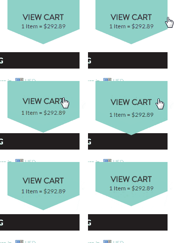
On Urban Road’s store, we added in microinteractions to help make the site look more polished and professional. When a customer hovers over the “view cart” tab in the header, it slides down a little. This simple effect is minimal but eye-catching, and helps keep the user’s attention. As explained by UX Planet, “motion attracts attention and brings user interface to life.”

Microinteractions on the Category Page
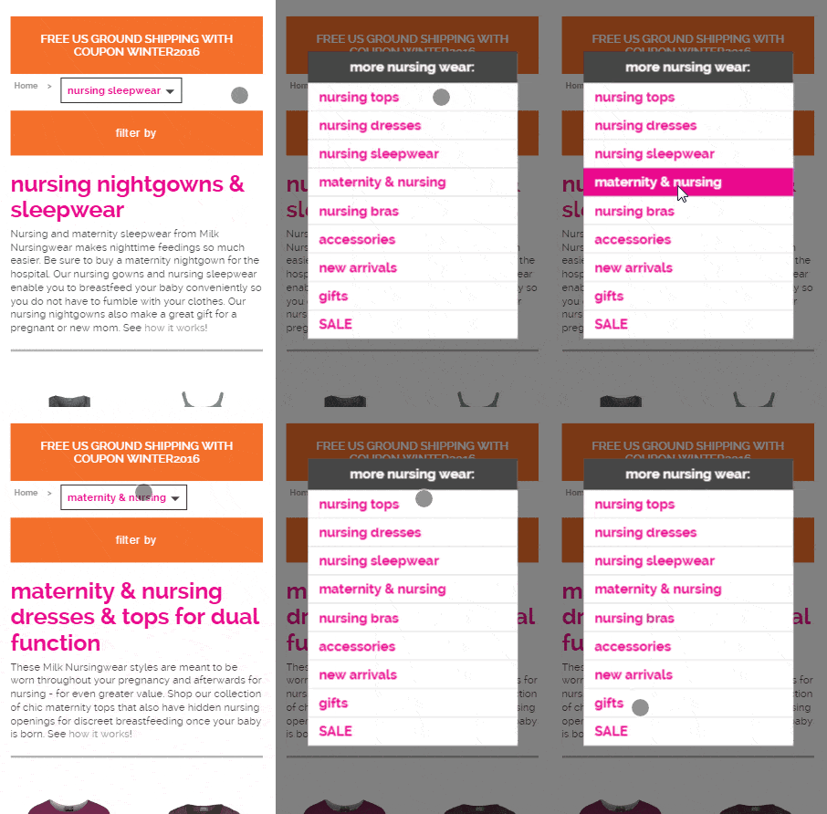
For Milk Nursingwear, we customized the category page breadcrumbs on mobile. Instead of being a static text line that lists the current category, we made it into a dropdown which lets the user navigate to other subcategories without having to go throughout the whole category structure again. This makes the site flow together more, and the user’s journey through the site is much more fluid.

Microinteractions on the Product Page
The product detail page is a key point in the sales funnel, so giving the customer feedback and interaction is beneficial. We built an Amazon-style section of related products to purchase for Fenix Store. This area displays on the product detail page right below the primary product’s images. Clicking the checkboxes for any of the related products removes them from the row, which confirms to the user that they won’t be added with the others. This animation is subtle and practical, but the minor details greatly contribute to the overall feeling of the site.

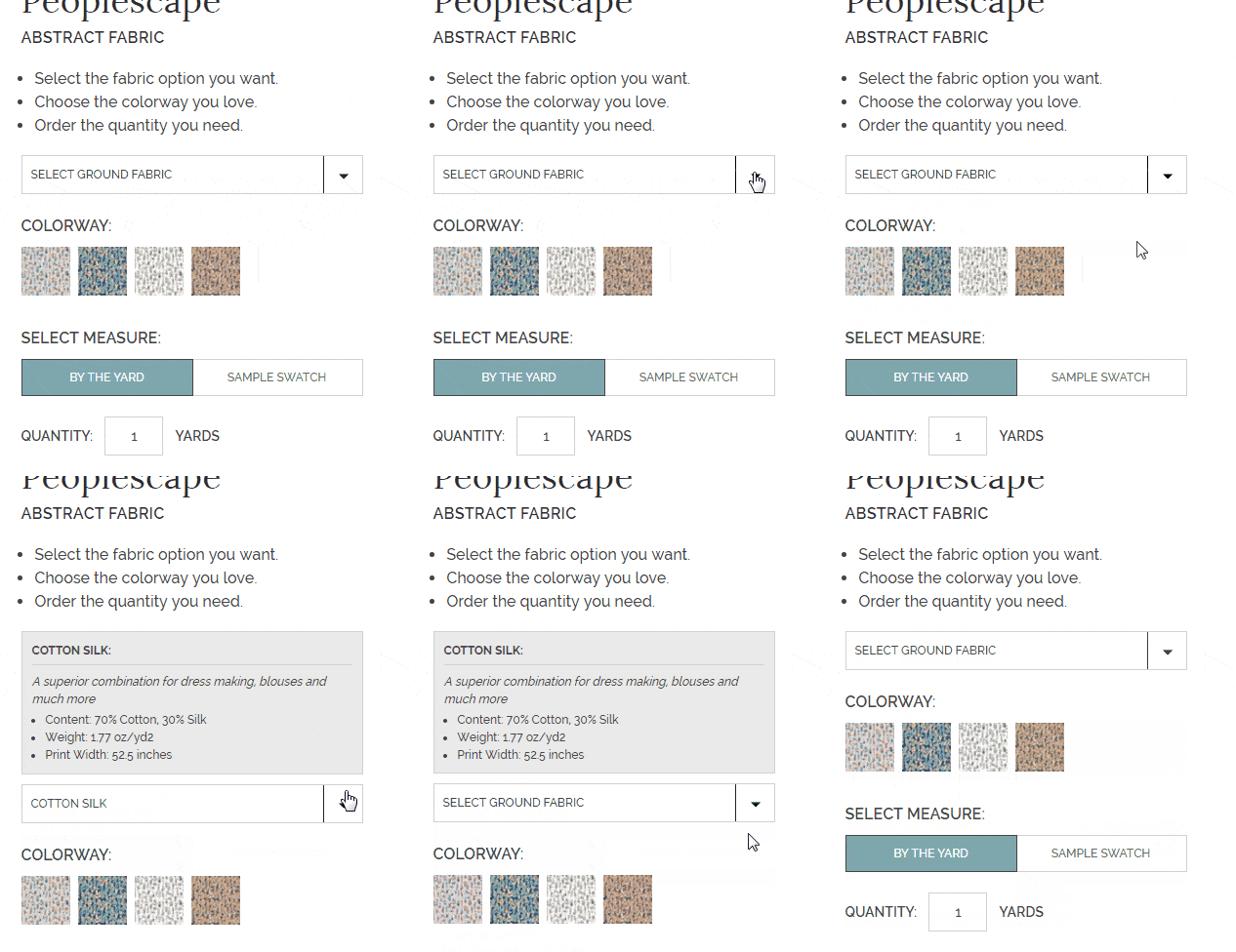
On PrintSaveRepeat’s site, each product option is different, and they often receive questions about specifics for each like the content and weight. We built a text box that fades in when an option is selected, so the customer will have the extra information they need to make the right purchase. If the customer goes back to choose “Select ground fabric,” the text box slides away seamlessly.

The Devil is in the Details
The goal in using microinteractions is to make the site clean and user-friendly. On eCommerce sites, you want your customers to feel comfortable making a purchase and paying attention to microinteractions is a great way to enhance the experience for your users. Keep the interactions simple and effortless, and your customers will feel that buying from you is easy.
We’d love to help you improve the user experience on your eCommerce store. Contact us today!


