Why Navigation Matters For Ecommerce Sites
Navigation is a crucial part of any website’s user experience but it can be hard to get it exactly right. While well-designed navigation directs customers to relevant products, poor navigation causes confusion and abandonment.
Taking the time to create a website menu that works with your product offerings and business model is an important part of optimizing your user experience.
The solution? Focus on your information architecture. Taking the time to create a website menu that works with your product offerings and business model is an important part of optimizing your user experience. Below, we’ve curated our top advice for menu design: the most basic, essential tips that can be leveraged for any industry or business.
Improve Interactivity With Transitions And Animations
Making a menu look “clickable” is an important step to making it user-friendly. Without interactivity, menus can appear overly laden with text, which discourages customers from clicking. Adding hover effects like color changes, underlining, or little animations (such as a tiny arrow or other icon) helps users more easily parse links.
Without interactivity, menus can appear overly laden with text, which discourages customers from clicking.
In the example below, hover animations add a fun touch while helping customers make sense of technical product names and small text. Customized hover states are a simple touch that make your site more visually sophisticated and usable.
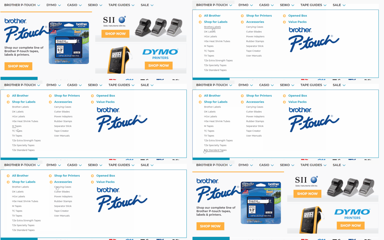
Here’s another example from a different website. This merchant sells watch parts, so our developer created an animation effect that mimics the hands of a clock. This example is also notable because it’s a left-hand menu, rather than a horizontal navigation.

We’re often asked if we think left-hand menus are completely outdated, or if we believe design rules that specify they should never be used. We actually think left-hand menus work well for some businesses – if well-designed, they highlight category and subcategory information in a way that’s useful for B2B businesses or businesses which sell technical products.
Include Images On Menu
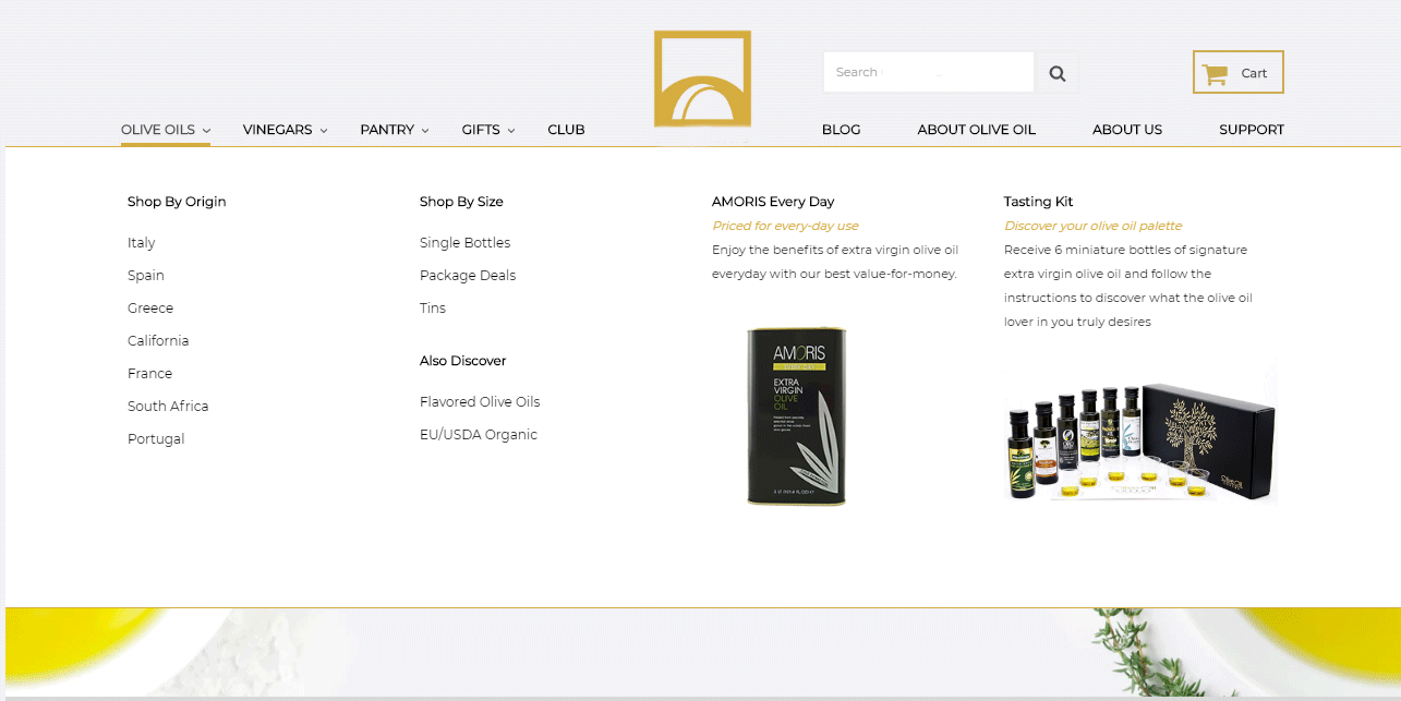
Images and calls-to-action are a great way to spotlight popular products, showcase sales, and generally add more visual interest to the menu. In fact, adding images is one of the most common requests we receive when designing custom BigCommerce menus for clients.
Images and calls-to-action are a great way to spotlight popular products, showcase sales and promotions, and generally add more visual interest to the menu.
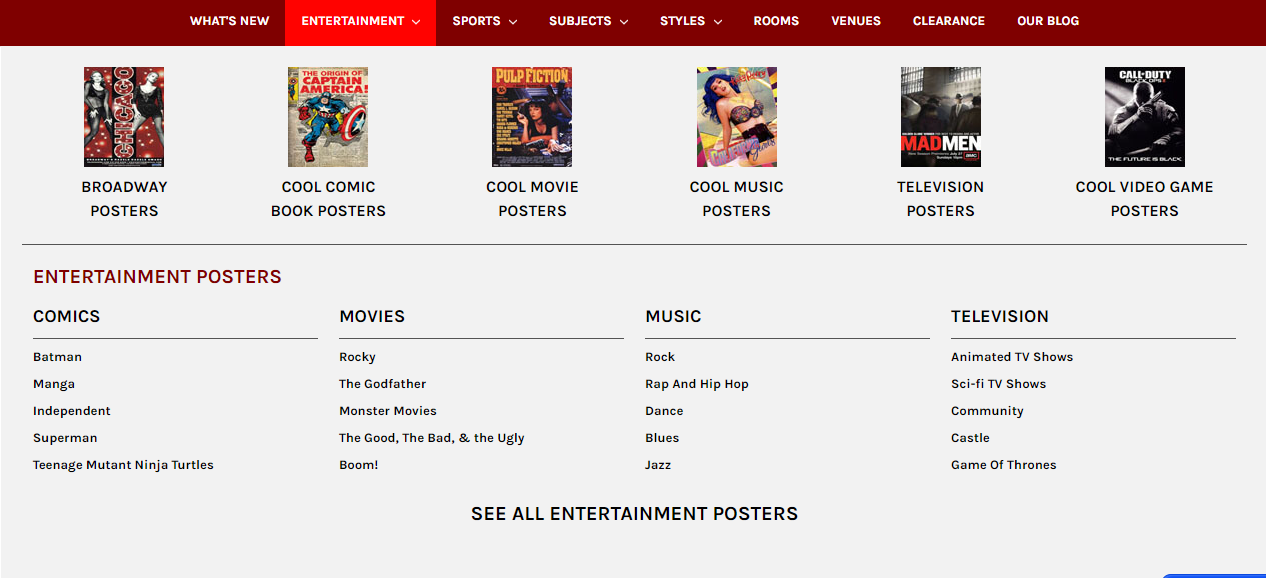
Images can be leveraged in a few different ways. In the example below, important subcategories become CTAs above the traditional menu structure, drawing in customers’ eyes and encouraging them to browse.
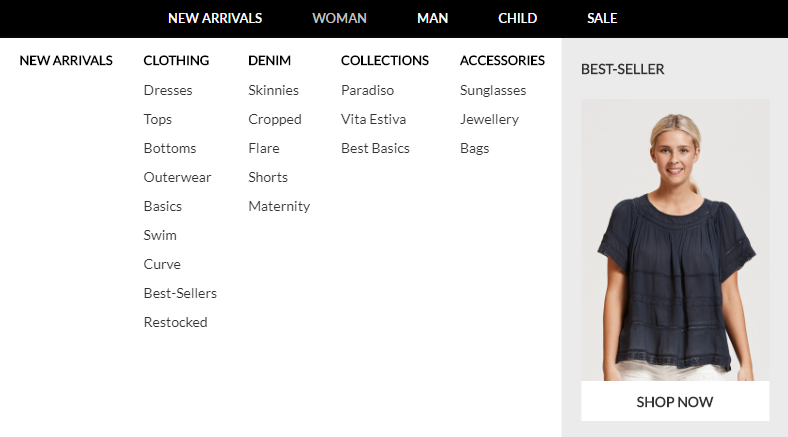
You can also use images to pull in special products or showcase promotional announcements (such a graphic advertising a sale or free shipping). In the first example, we see a menu that pulls in a featured product for each category, showcasing a different product for men, women, and children. The second example showcases two of the brand’s best-selling “starter products,” helping new customers find the items they’re most likely to purchase.
You can also use images to pull in special products or showcase promotional announcements (such a graphic advertising a sale or free shipping). In the first example, we see a menu that pulls in a featured product for each category, showcasing a different product for men, women, and children. The second example showcases two of the brand’s best-selling “starter products,” helping new customers find the items they’re most likely to purchase.
Mobile Friendly Navigation
One of the biggest challenges of responsive design is shrinking your menu in such a way that it still works and looks great on any device. And with the growing influence of “m-commerce”, getting your site menu’s mobile navigation in order couldn’t be more important.
Space is at a premium on mobile, so keep things simple.
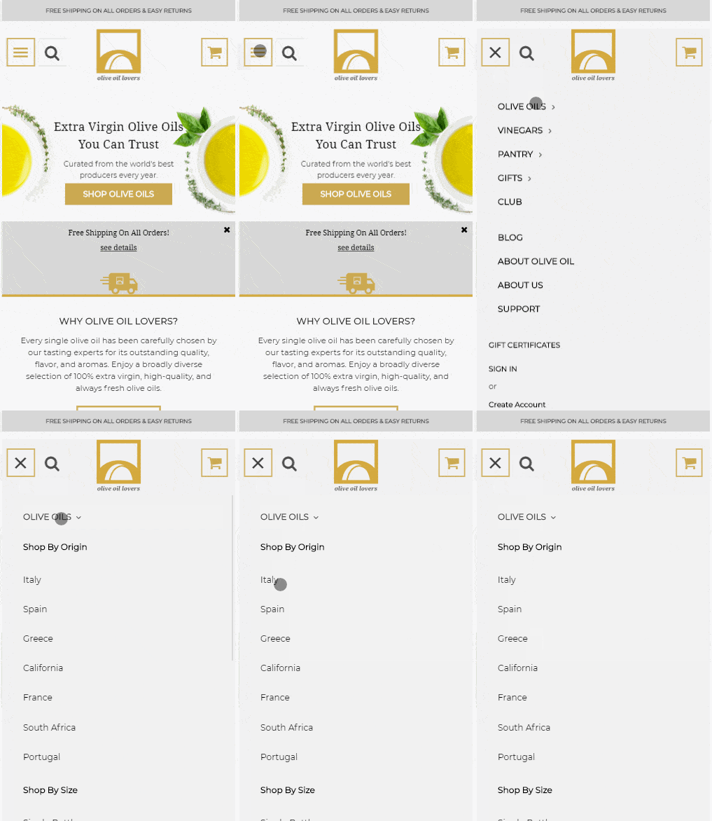
Space is at a premium on mobile, so the cardinal rule of design is to keep things simple, with the most important information accessible at the top. As you can see in the example below, the mobile version of OliveOilLovers’ menu is much more streamlined than the desktop version pictured above. The most popular categories (Olive Oil, Vinegar, etc) are listed first, with the subcategories nested under dropdown arrows. The overall mobile experience is neat and streamlined, saving the images and elaborate CTAs for desktop users.
Get A Custom Mega Menu For BigCommerce
Interested in a bespoke mega menu for your BigCommerce site? We create beautiful, user-friendly menus that boost your branding. Call us today and get a UX consultation on how we can make your site’s navigation the best it can be!


