We talk about the positive effects that clients experience when migrating to the BigCommerce Stencil framework, but what does it actually look like from a granular perspective? Well, the answer will vary, depending on what your business is actually doing online. One thing is for sure, when you work with us, your site is going to receive much more than a facelift.
BigCommerce’s Stencil Framework Will Change The Way You Do eCommerce
We’d be remiss if we didn’t continue to drive home a few things. So, let’s reiterate: Stencil is BigCommerce’s most current framework, and it has been built from the ground up for better overall site performance and best practices from a technical and SEO(Search Engine Optimization) perspective. It is no exaggeration to say that the Stencil framework has been meticulously developed for web standards compliance, web design and development best practices, accessibility, and improved merchandising and marketing all around.
IntuitSolutions has taken liberties with Stencil and
Users will have unparalleled access to your eCommerce site from a slew of different devices, and their experience will be a great one. If you have a vision for the future of your website, we want to help you achieve and exceed your goals, and sometimes that means adding a few “cherries” on top.
SpecialtyBottle.com’s Stencil Upgrade
SpecialtyBottle.com is a wholesale provider of interesting glass bottles, jars, metal tins, and plastic containers. A huge catalog of products across a vast array of different categories dictated that special attention be paid to page load speed, organization, presentation, and purchasing options. Specialty Bottle also required a seamless transition from their Blueprint site into their brand new Stencil site.
No problemo.
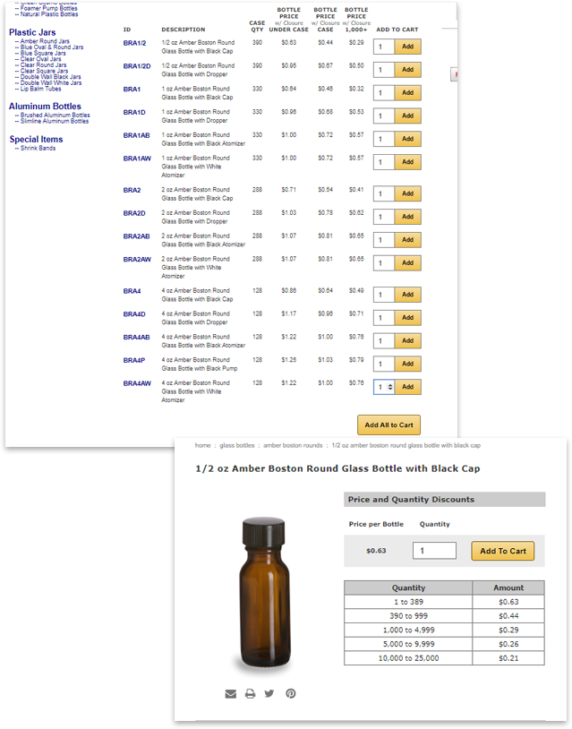
We created a highly customized experience for SpecialtyBottle.com’s customers. By incorporating things like single page purchasing(see it here), and bulk pricing tables(see it here), we were able to create a user-centric experience that streamlines everything from the ground up, and that means an attractive, easy to
Here are some before and after images of their site:
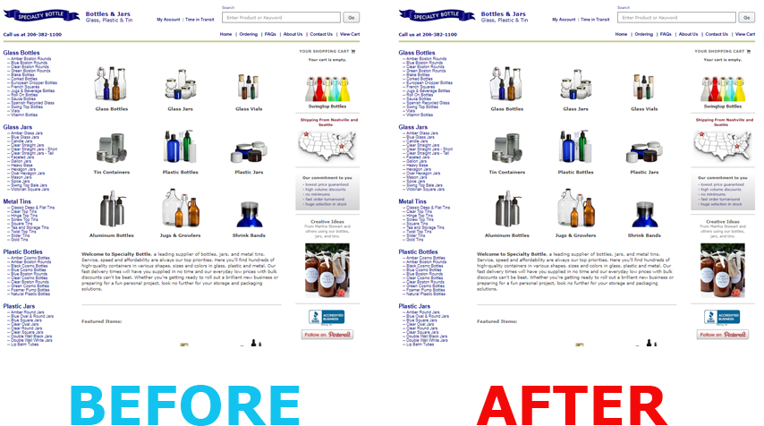
Notice anything special about the above images? No, this isn’t a
ESSLINGER.com’s Stencil Upgrade
Effectively delivering a large selection of products alongside of a positive user experience to customers is no problem for Stencil, but we’ve taken things a bit further with ESSLINGER.
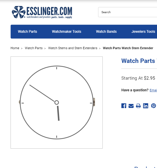
If you visit the site(here) and click around for a bit, you will notice some interesting stuff going on. Improving the experience and staying on brand, we’ve created custom “LazyLoad” images that display an animated graphic of a watch that displays while the site’s product images load. Connecting the dots with branding was a must, so you’ll also notice some interesting graphics and animations happening on the custom 404 Error page we created.
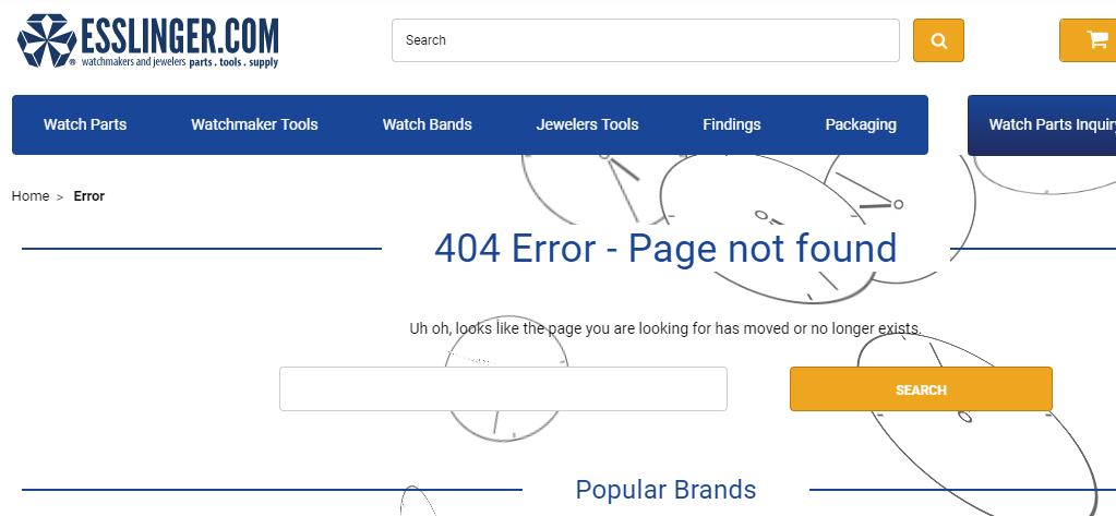
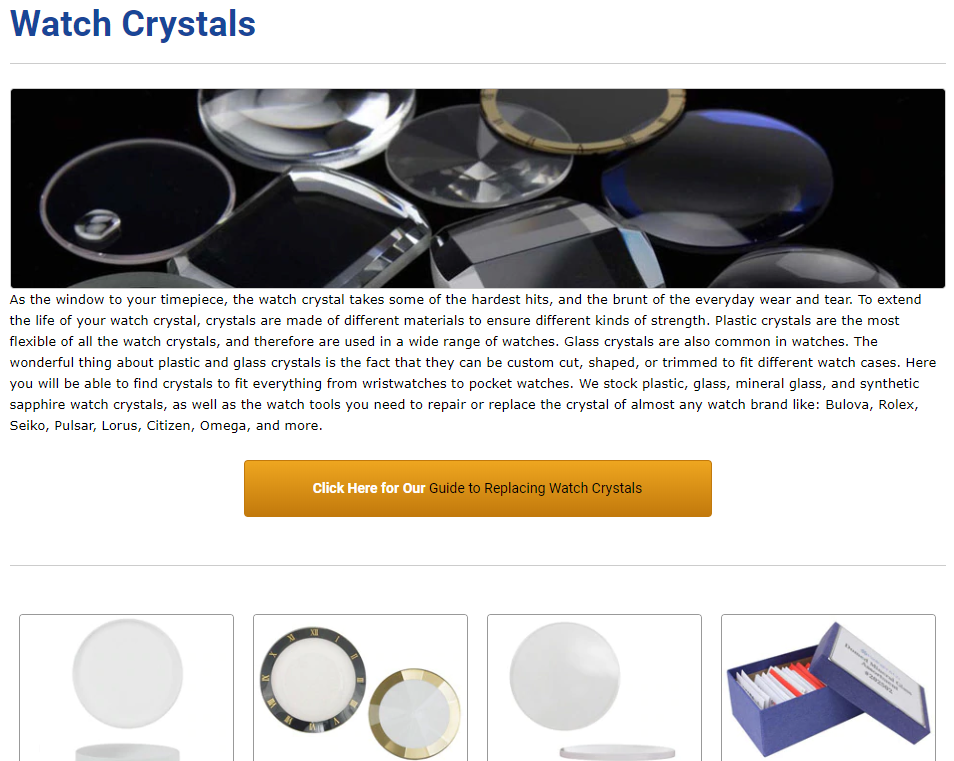
“Cherries” on top are obviously not the singular focus of any design, and Stencil’s power shines through obviously within ESSLINGER.com’s top and sub-level category pages(see it here). Notice how the graphics and layout make for a friendly browsing experience, and most certainly will help with search engine optimization as well.
Check out these before and after images:
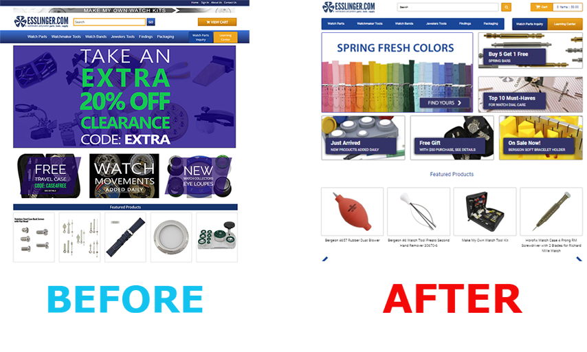
You can see that the old site seemed very crowded, yet it wasn’t effectively displaying the same amount of actionable content as the new design. The site was also visually disconnected from the ESSLINGER brand. Within our redesign, you see easy access to important actions, products, and information above the fold, all visually grown up and in-line with an accurate representation of the brand and its audience.
The Stencil Difference Is Clear
Planning for the future is an important concept within the eCommerce ecosystem. Your current site might be keeping you afloat, but the face of shopping online is changing rapidly, and the importance of streamlining the experience for your customer is increasing. Search engines like Google are placing importance on things like the cleanliness and overall value of your site’s structure and content, and if you want to compete in the rankings, you’ll need to consider these factors.
Stencil’s real strengths shine brightly when you look under the hood. To put it simply, you’ll have more options and flexibility from a technical and sales perspective, when you look ahead and do what you can to strengthen your site’s core. Moving to the Stencil framework should be a process that is built around your business’s current and long-term goals, and we’re here to make sure that happens.
Contact Us Today To Get Started


